Shopify mobile optimization is non-negotiable. And it’s not just about having solid Shopify SEO. So many people shop on mobile devices that you must capitalize on the growing mobile eCommerce trends.
The only question is how to optimize a Shopify store for mobile the right way?
We prepared 11 tips for Shopify mobile optimization that cover all bases, let’s dive straight in.
Store images are one of the reasons for slow page speed on mobile. Try TinyIMG today with 50 free image optimizations
Install now11 tips to optimize a Shopify store for mobile
Many tips and tricks out there can help with mobile SEO and user experience for your Shopify store. We’ve pulled together the essentials.
Here are 11 tips to perfectly optimize Shopify store for mobile:
- Make navigation bar accessible
- Adjust visuals for mobile screens
- Highlight product images
- Optimize mobile page speed
- Hone CTA buttons
- Adjust font size for mobile visibility
- Carefully consider the amount of text
- Avoid pop-ups
- Fix all layout shifts
- Perfect the mobile checkout page
- Use mobile forms correctly
Full disclosure - if you pick a good Shopify theme for mobile, you won’t have to worry about most of these steps.
Nonetheless, it’s a great list to cover and ensure you’re complying with Shopify mobile site expectations.
Make navigation bar accessible
If we’re browsing through a bunch of products or comparing, we want to have access to the navigation bar in one tap.
Sticky navigation bar is essential for a good user experience on mobile devices. You’ll keep the menu bar in view while letting the scroll-happy browse and find exactly what they’re looking for.
Adjust visuals for mobile screens
Even with a top Shopify theme, sometimes the mobile design can go a bit wonky if a website was built primarily for desktop viewing (which a lot of times is the case).
Don’t let that happen - displaying Shopify responsive images is crucial for a smooth mobile user experience.
Look over your eCommerce store on your mobile. Check how images are cropped, how the banners are sized, and how video or other rich media appears. If your product shots are somehow pixelated or your banners are cropping out your key product, it could definitely be affecting how people see your website.
Highlight product images
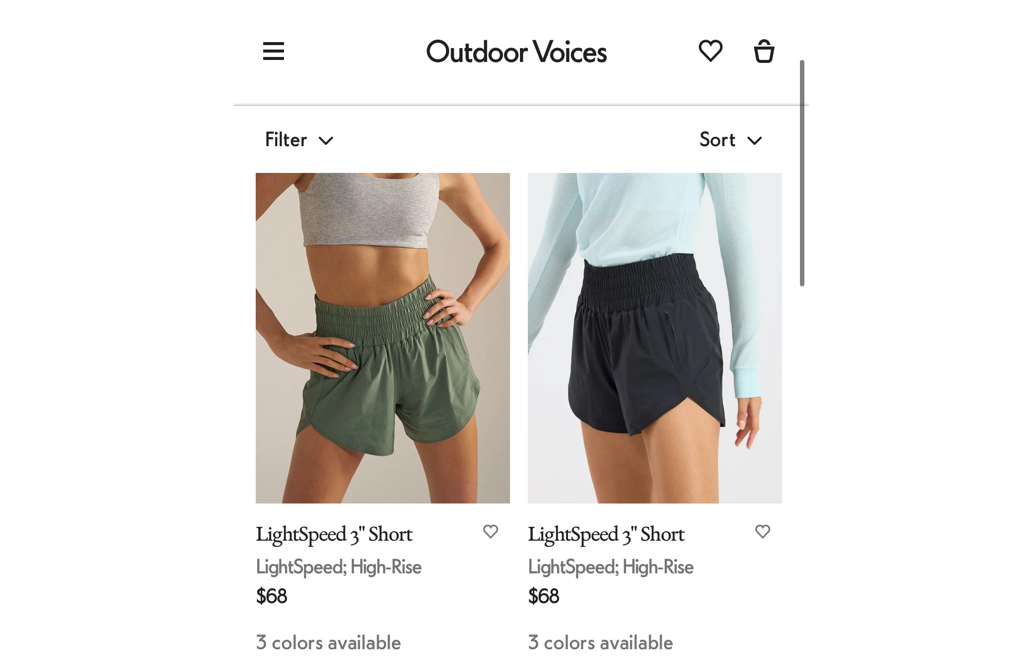
You want to include your products front and center on your Shopify site. That’s especially true on mobile, where screen space is limited.
Leave every unnecessary page element behind and bring forth your product images. For this to really be effective, your products should be shot and presented in a similar way.
Additionally, if you can show your product in use, it’s easier for customers to see themselves using it. More technical things to consider include:
- Writing proper alt attributes that describe the image.
- Compressing the image file size to be optimized for web and site speed.
- Cropping the image to ideal dimensions for the specific placement you had planned.
- Use the most appropriate file type, generally either .png or .jpg for Shopify product images.
Optimizing each image manually might take much time. Automate the process with TinyIMG and take advantage of other app features
Try TinyIMG for FreeOptimize mobile page speed
Shopify speed optimization is no small matter. Who wants to wait for a website to load?
People are impatient, so Google has found a way to measure and integrate site speed into how they rank websites in search results. With Shopify sites in particular a few of the top tips include:
- Choose a fast Shopify theme
- Compress and resize your images
- Host videos externally
Hone CTA buttons
A CTA button is what makes or breaks the purchase, so get them right.
First, you want to make sure your mobile tap targets are optimized. Fingers can be clunky on phones, particularly your thumb, so don’t hold back on the button size.
Generally, buttons should be at least 48 pixels wide, with at least 32 pixels of white space on top and bottom, separating them from other elements on the page.
Tip: A/B test fixed (remains in the same position on page) vs sticky mobile (remains either at the top or the bottom of the page as people scroll) CTA buttons.
As any good CTA, mobile ones should include action verbs and guide your customers towards a purchase with eye-catching colors.
Times New Roman at 12-point size is probably best left in the past. A larger font size (think between 14 and 16 pixels, or 1 rem if you’re using that) will probably better serve everyone, especially those reading on mobile devices.
Larger font size may mean changing how you lay out your mobile site. For example, if you had a smaller font size and multiple columns on a mobile screen, if you increase your font size, you may end up with only a few characters in a line per column.
Not an ideal experience.
In a situation like that you’d probably want to change the layout of the columns so they stack on mobile but not desktop.
Suggested reading
Carefully consider the amount of text
On the Internet, we tend to scan rather than really deeply read and take in information. This is particularly true on mobile. Because Google’s search results are based on the mobile site, you want to keep all of the information you have on your desktop site on your mobile site.
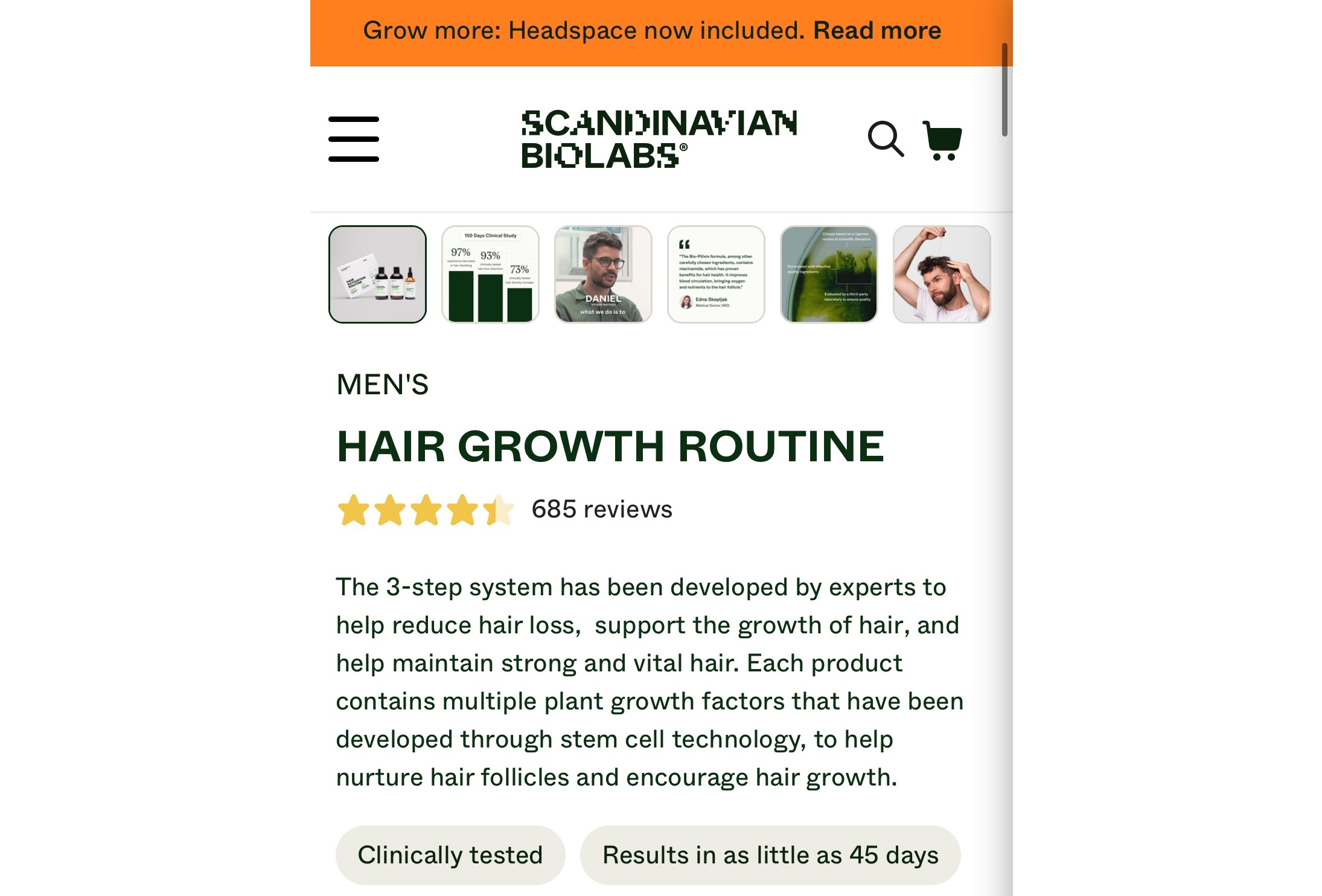
With that in mind, it’s probably best to design your content (mainly Shopify product descriptions) with mobile scanning in mind:
- Keep paragraphs short;
- Use elements like numbered or bulleted lists where you can;
- Video or animations can break up text and easily explain complex concepts.
If you want or need to include a lot of detailed information on your Shopify store, consider including it in accordions so people on your site aren’t immediately confronted by an unbroken wall of text about product or delivery details.
Avoid pop-ups
We have one word for pop-ups on mobile sites: avoid. Think about it from a customer’s perspective, or even your own experiences when you’re shopping. Pop-ups can be a small bother on desktop, but for most of us, on mobile, they’re downright insufferable.
A lot of times they take up the whole screen, sometimes it’s hard to find how to close it, maybe you press the wrong thing and end up signed up anyway. It’s not fun.
So there’s no need to push this poor experience onto your own customers. Make things as seamless and easy as you can.
Fix all layout shifts
Layout shifts can be a side effect of poor site speed or the use of extensive JavaScript on your Shopify site. Many of the recommendations we’ve already listed here, particularly around images, can help with reducing cumulative layout shift. Specifically, try to:
- Set width and height on all images
- Reduce image file sizes and makes sure they’re the correct dimensions
- Try not to use pop-ups
Perfect the mobile checkout page
While generally you want your entire website to be mobile-friendly, this is even more the case for the checkout. A few things to keep in mind when building a seamless mobile checkout:
- Integrate with different payment options, not just ShopPay or PayPal
- Keep the design minimal and make the buttons clear through strong contrasting colors
- Only ask for the information you absolutely need. Not only is this respecting your customer’s privacy, but it also makes it easier for them to finish their purchase more quickly
- Make the checkout button easy to find on your website.
Use mobile forms correctly
For many of us, mobile forms are a part of the primary conversion on our website. Sometimes that’s mobile forms in the checkout process, other times, it’s a registration of interest or contact form completion.
Regardless of where or when a form is on your website, you should keep mobile in mind when designing and building:
- Break up form fields over multiple pages if you can’t have a short form
- Correctly code different types of form fields and use them: radio buttons, drop downs, tick boxes. Anything that keeps a customer from typing too much will probably be helpful.
- Keep the font size consistent (and large) across your entire mobile experience
- Treat forms similar to CTAs, with a clear tap target and enough padding around each element.
Why is Shopify Mobile optimization important?
Two main reasons make mobile optimization for Shopify both mandatory and super profitable.
For starters, Google is mobile-first, meaning that only mobile-friendly Shopify stores will have a chance to compete for high search engine rankings. And we all know how important organic traffic is for long-term growth strategies.
Second, 76% of shoppers use mobile devices for their eCommerce purchases because it’s faster, but only 12% find it actually convenient. The potential for meeting consumer’s mobile shopping expectations and in that way increasing revenue is unmatched.
Checking your Shopify store mobile optimization
While all of these changes are great, it’s likely worth running a post-launch check on everything. Sometimes your own eyes and your own experience is the feedback you need that what you’ve done works.
Some other, more technical and specific checks to run include:
- Pagespeed insights: Comparing mobile and desktop speeds pre- and post- changes will help to understand how site speed is impacting your mobile experience.
- Google Search Console: If Google detects any mobile issues, they will be flagged under Mobile Usability review found in the Experience Report. Once you resolve them, you can mark them as fixed and the page will be re-crawled.
- Google Analytics: If you have Universal Analytics, you’ll have a detailed report on Site Speed. Generally, the ability to add device type as a secondary dimension to all reports should give you the chance to drill down into mobile performance and compare it to your website benchmarks.
- Google’s mobile-friendly test: While the actual “result” is a relatively basic Yes/No, you’ll see more detail around any issues you may not otherwise find in your scripting.
- Your browser: The console in your browser is one of your strongest tools to debug and sanity check issues that could be affecting your mobile experience. Be warned, the device type emulator in the Chrome browser doesn’t always react in the way a device actually would, so if you can swing it, using something like BrowserStack as an emulator is a good second check.
Suggested reading
Summary
The most straightforward way to optimize a Shopify site for mobile is to build it with mobile in mind from the start. That being said, follow these steps with an already existing site, and you’re well on your way to a mobile-optimized Shopify site.
If mobile accessibility and optimization weren’t a part of your process before, after this article hopefully it becomes a part of your day-to-day improvements and ongoing review.
Curious to read more? Check out these articles:
- Shopify Structured Data: Why and How to Add It To Your Store
- Shopify lazy loading and why it's good for your store
- Shopify Responsive Images: What you Need to Know

Frequently asked questions
On a base level, yes, Shopify is a mobile-friendly eCommerce platform and mobile users can access your Shopify store. However, how mobile-friendly your eCommerce store really is largely depends on your chosen Shopify theme.
The easiest way to make Shopify store mobile friendly is to pick a Shopify theme optimized for mobile. If still in doubt, go over 11 steps presented in this article and optimize your mobile store to perfection.
To edit your mobile view, go to the Shopify admin, then Mobile view section and click Customize text. However, you can edit only the font, style and color of text on mobile. In order to make changes to layout or other page elements, you will need to edit your Shopify theme’s code.


