Google started its focus on mobile SEO all the way back in 2014. Back then, many websites had no mobile-friendly versions, and browsing them was real torture.
Today, mobile SEO is at the forefront of any successful SEO strategy.
Learn about the importance of mobile SEO, how to optimize your website for top-notch mobile performance, and test the outcomes. After reading this guide you’ll have a wholesome understanding of mobile site optimization and what you have to do to make your site accessible to mobile users.
Shopify mobile SEO starts with optimized product images. Automate your image optimization efforts and improve mobile store speed with TinyIMG
Get TinyIMG nowWhat is mobile SEO?
Mobile SEO (Mobile Search Engine Optimization) is the practice of optimizing your website to perform well on mobile search engine results. Mobile SEO encompasses a broad range of practices, from page speed and metadata optimization for mobile users to limited popups and mobile sitemaps.
The ultimate goal of mobile SEO is to make website text, images, and videos easily accessible for those browsing on their smartphones, or tablets - basically, anything that’s not a desktop. Mobile SEO practices also ensure that your site’s UI and navigation take mobile users into account.
Why is mobile SEO important?
For starters, according to Google Developers, mobile-first is the default way Google crawls and indexes new websites. Even for older ones, mobile usability plays a massive factor in good overall page rankings.
On top of that, mobile search is overtaking desktop experiences. If we take a look at Statista, back in 2013 only around 27% were using their mobile devices for search engine visits, whereas in 2021 this number grew all the way to 61%. Needless to say, this trend is not going anywhere.
It should be in every website owner’s best interest to learn about mobile SEO practices and how to implement them, and this is what we’re about to cover.
Quick example: A local roofer in Austin partners with RoofingSEO.Services to improve mobile site performance after noticing that most leads come from smartphones. They move to a responsive theme, compress oversized hero images to WebP, add lazy loading, and trim intrusive popups. Titles and H1s are rewritten for intent (e.g., “Emergency Roof Repair | Austin, TX”), and the homepage adds a clear internal link to the service hub using the anchor text roofing services to guide both users and Google. The team implements LocalBusiness schema with JSON-LD, fixes small tap targets, and adds a sticky “Call Now” CTA.
Result: faster load times, higher tap-through to quote requests, and improved visibility for keywords such as "roof repair near me" and related terms.
Mobile SEO best practices
So, how to improve mobile SEO? Use these 9 mobile SEO practices:
- Implement a mobile-friendly website configuration
- Optimize titles and meta descriptions
- Optimize images for mobile devices
- Improve mobile user experience
- Optimize mobile website speed
- Use structured data for mobile pages
- Ensure content accessibility
- Optimize video and animated content
- Submit mobile sitemaps
Let’s dive into each of these mobile SEO aspects with recommendations for proper mobile site optimization.
Implement a mobile-friendly website configuration
The three most popular ways to ensure mobile visibility are responsive design, dynamic serving, and separate URLs for desktop and mobile versions of your website. They differ based on the solutions you need for your HTML, CSS as well as URLs used to access your web pages.
Responsive Web Design - Recommended
The concept of responsive design is rather self-explanatory - your website is supposed to respond and adapt to the environment in which it is being used.
Responsive web design is basically a mix of grids, layouts, and CSS that all come together and react to device characteristics, serving content in a way that’s accessible to that reader.
Among its biggest perks is the fact that your HTML and CSS remain unaltered, meaning you serve one and the same version of your page everywhere, the only difference is how it shows up. You also don’t need to worry about separate URLs and canonical tags to explain relationships between different versions of the same page.
The only need to be concerned with including the viewport element and using CSS media queries correctly.
Dynamic serving
This way of adapting your website to different screen sizes involves serving different HTML and CSS depending on the user’s devices.
Vary HTTP header is the key factor in the success of this configuration. You should use it to specify which version of your website is supposed to be served at which instance - those browsing on a Samsung S7 tablet should get its version, whereas those using iPhone 13 should get their respective design.
The biggest downfall of this mobile SEO method is that you have to design a website version for all popular devices. With the level of technological advancement we’re witnessing, this method for a mobile-friendly website is hardly scalable.
Separate URLs
This configuration is also pretty self-explanatory - all of your website versions not only serve different CSS and HTML but also have different URLs.
It’s by far the most outdated and the least scalable way to improve your mobile SEO, even Google itself does not recommend it. Plus, it’s a pain to manage. If for whatever reason you’re forced to use it, make sure your <link> tag with rel="canonical" and rel="alternate" elements are on point, otherwise, you risk duplicate page issues and broken website structure.
Optimize titles and meta descriptions
The best metadata optimization practices for general and mobile SEO aren’t all that different. Your meta title is a ranking factor and needs to contain a focus keyword, whereas your meta description should be a good summary of your page content, include a call to action, and in general be inviting.
The only additional aspect to consider is character length. The meta title should include around 70 characters, while the meta description should be between 120 and 160 characters to look good and be fully displayed on SERP no matter the device.
Here’s an example of a good meta title and meta description:
The meta title doesn’t exceed 60 characters, while the meta description includes a call to action and a sneak peek into some of the mentioned games.
Related article
Optimize images for mobile devices
Visuals are an inseparable part of a quality mobile website but don’t forget to optimize them.
Featured or hero images, if not optimized, can easily take up several folds of mobile screen. Knowing mobile user habits, it’s easy to assume that if people need to scroll a lot to get to the actual content, they will quickly leave the website. To have your featured and decorative visuals optimized for mobile SEO, adjust their size to fit into the top of a mobile screen or remove them altogether.
But how do you handle images that are integral to your website, such as product photos? They can still negatively affect your mobile SEO and mobile site speed if not optimized, but you can’t remove them.
To ensure your images comply with the best mobile SEO practices, you should implement responsive images, change their format (for example, to WebP), and compress them to save space.
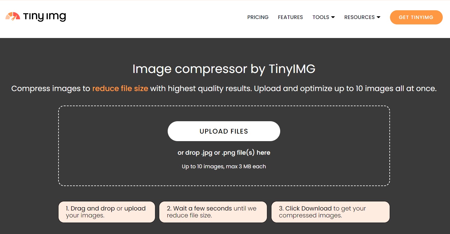
You can easily compress images for free using the online TinyIMG image compressor. All you have to do is upload your images by clicking the “Upload files” button.
Once the compression process is complete, simply click Download to get your files.
Are you a Shopify store owner? Take your mobile SEO to the next level with TinyIMG, an app designed to serve the most optimized mobile version of your images.
Improve mobile images nowImprove mobile user experience
The way mobile users interact with their devices and the content on them is drastically different from the behavior seen on desktop devices. Adapt to that for a successful mobile SEO strategy by considering these three foundational mobile UX aspects.
Content readability
A mobile user opens your website and they don’t need to zoom in, scroll, or squint. Instead, they can immediately start reading.
That’s what mobile-optimized website content should look like. To get there, you need to take care of a few aspects:
- Font size. At least 16px is advised for responsive websites.
- Contrast. People often use their mobile devices outside, plus the screen size is significantly smaller. If there isn’t sufficient contrast between your background and text or images, the content will be difficult to read.
- Paragraph length. Break up your content into short paragraphs, 2 or 3 lines at most. The idea here is to avoid paragraphs that stretch further than a single-screen fold.
- Line length. When creating content, orient towards 60 characters per line.
Element size and placement
Element placement to allow easy mobile on-page interaction is crucial for mobile SEO. This is especially true with buttons - there is nothing more frustrating than misclicking and ending up somewhere you never intended to be.
Three main notes here:
- Use negative space. Unlike when designing for desktop, with mobile devices, the more space you have around a clickable element, the better.
- Place buttons strategically. Instead of leaving them somewhere at the top of the page, place social share buttons in a sticky sidebar or bottom bar.
- Space out links. Any contextual links you place in your text should be far enough apart that mobile readers can click on them without any issues.
Take care of mobile page speed
Every user expects a fast-loading website, especially when they’re browsing on mobile. That’s why mobile page speed should be one of the utmost priorities for an effective mobile SEO strategy.
Mobile page speed best practices don’t differ all that much from overall website speed optimization. You have to compare the fastest web hosting sites and choose the one for your project, take care of image size, minimize HTTP requests, leverage browser caching, minify HTML, CSS, and Javascript, as well as fix redirect chains.
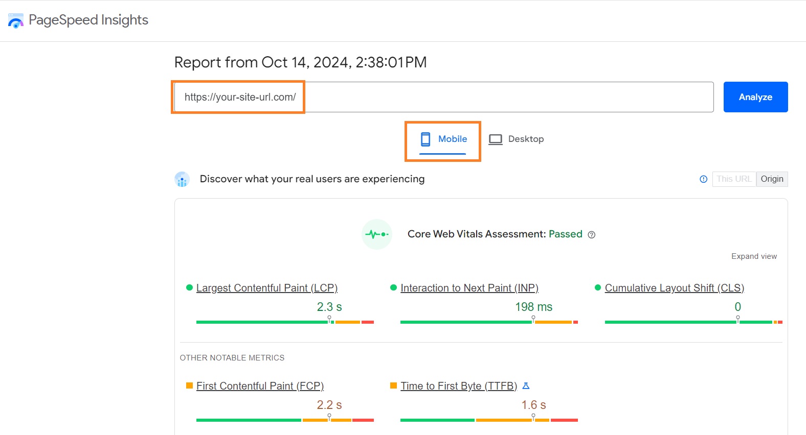
You can check your website performance on such tools as Google’s PageSpeed Insights. All you have to do is insert the link of your site and choose the Mobile performance report.
You can read more about Shopify speed optimization in our in-depth guide.
Running a Shopify store? Optimize your website speed using TinyIMG
Improve your store speedOptimize for local searches
According to Google itself, 94% of all local searches happen on mobile devices. If you’re running a local business, take advantage of the perks GPS is providing for you and optimize your website for local searches.
A well-optimized website for local searches on mobile should:
- Provide basic company information. Display the business name, address, phone number, and other necessary info in multiple places on the website. It’s best to place this information in the footer and the contact page.
- Display reviews. Ensure that if customers leave reviews about your business on review sites or on Google, they find their way to your website. Social proof is one of the most likely ways to attract people browsing for local services on the go.
- Create local content. While it’s great to rank for “Guided tours near me”, don’t limit yourself to that. Do research around long-tail local search queries, such as “Top things to do in Toronto during the summer”, and create valuable content with tips and you can attract people searching for local attractions.
Tip: Quite a few businesses still haven’t claimed their Google My Business listing. Don’t fall behind and make sure you connect with people searching for your services on Google Maps.
Implement structured data
Just like desktop results, mobile SERPs display rich results. You want to capture as many of them as possible because rich snippets significantly improve click-through rates.
Any structured data markup you implement for the desktop version of your website should work just fine on mobile as well.
We already discussed the importance of optimization for local search queries. Structured data can help here too! The emphasis should go on Local Business schema markup, preferably using JSON-LD.
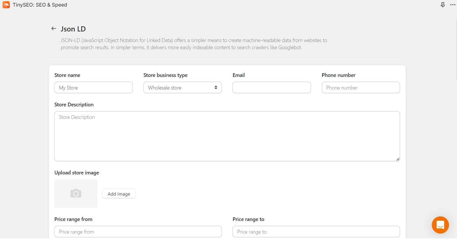
If coding isn’t your strong suit, the easiest way to implement JSON-LD is using the TinyIMG app on Shopify. It lets you easily enter information about your business – all you have to do is click Save.
Implementing JSON-LD allows you to display panels with detailed business information including working hours, customer reviews, contact information, and more. It’s incredibly valuable - you immediately inspire trust in your business and provide people with all the information necessary to choose you over your competitors.
Make all content accessible for search engine bots
Sometimes website owners think that the amount of content they display on the desktop version of their website feels crowded on mobile and decide to hide some of it.
With Google being mobile-first, whatever is hidden from the mobile version is hidden from Google, meaning you should make the same version of the website accessible to all users.
If the text you’re displaying seems excessive, use collapsable bars, jump links, or other on-page features to ease user navigation, but do not block or remove CSS or Javascript files from your mobile pages.
Tip: Unsure of what Google sees when it visits your mobile site? Use “Fetch as Google” and look at your robots.txt files to see if anything is being hidden from mobile users.
Optimize video and animated content
You don’t want mobile users seeing broken videos or blank spaces instead of animations, it’s bad for user experience and for mobile SEO.
Any animated or video content you embed in your website should come in HTML5 format. It’s optimized and designed to function on all browsers of all devices. Video content displayed using some other software, such as Flash, might not work on mobile devices, causing broken links and low mobile rankings.
Create mobile sitemaps
If your website runs on dynamic serving or separate URL configuration, you would benefit from a separate mobile sitemap. This way, Google has an easier mapping out your mobile site structure and what mobile visitors are seeing.
Note that if you have the responsive design implemented, a regular XML sitemap is more than enough to help Google understand your site structure - yet another reason to choose a responsive design.
Mobile SEO tips for eCommerce websites
If you’re running an eCommerce store, mobile SEO should be an even bigger priority of yours. Stores without an optimized mobile version are at risk of losing many, many customers.
On top all of the best general mobile SEO practices listed above, make sure to:
- Set up canonical tags. In some cases, for instance, when using Shopify, your product pages might end up being duplicated on different URLs (e.g. main and collection product pages). Set up canonical tags pointing to your main product page to avoid duplicate content issues.
- Sort out filter indexing. Filtering is an incredible way to ease site navigation and improve the mobile SEO of your eCommerce store. However, if you create too many filters and all of the pages are indexed, it can once again create duplicate content issues. Organize the number of filters and their pages by following the best product filtering practices for mobile SEO.
- Use eCommerce tools for mobile SEO. WordPress SEO plugins or Shopify apps for SEO are designed to improve your store’s performance on mobile search.
Tip: If you’re a Shopify store owner, dive deep into Shopify SEO with our comprehensive guide.
Test your website mobile optimization
Now that you know what steps exactly you need to take to have a mobile-friendly website, it’s time to figure out how well your website is doing in the mobile SEO department.
There are main tools and ways to test how well-optimized your website is for mobile users.
Here is a bit on the main ones.
Google Search Console
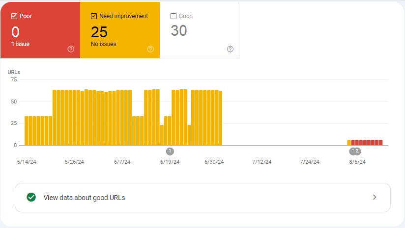
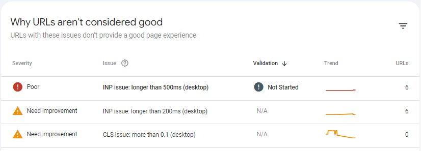
Google Search Console is a great tool for getting insights into your mobile website. For example, you can open Core Web Vitals in the Page Experience tab and click on the “Mobile” section. This will show you all of the URLs of your mobile website and help you find poor URLs, good ones, or those that need improvement.
If you scroll down, you can also find information on why the URLs aren’t considered good. You’ll be able to find specific issues and all the URLs with the same reasons for not being good.
You want to take all warnings from Google Search Console seriously and put effort into resolving them for good mobile SEO.
Tip: Whenever you fix mobile SEO issues you noticed in your Search Console report, submit your page for indexing. The faster Google sees you made the necessary changes, the faster your page will start ranking well.
Check how your mobile website looks
There is no better way to spot mobile SEO and usability problems than seeing what your mobile version actually looks like and how it performs.
If you’re a Chrome user, use DevTools to view your page on mobile. Toggle Device Mode at the top left of the DevTools dashboard. You can also adjust screen resolution at the top of the page to take a look at a specific size device you’re interested in.
Mobile SEO: summary
Both your website visitors and Google expect your website to have a proper version for all devices used to access your website. That’s why if you want your website to do well on search engines and have low bounce rates, there is no escaping mobile SEO.
Apply the best mobile SEO practices listed in this guide, adapt them to your website and preferences and you’ll come out with a website that’s optimized for mobile users, ranks well on search engines, and converts.

Frequently asked questions
Mobile SEO refers to the optimization of a mobile website for search engines to find and include in SERPs (Search Engine Results Pages). Learning how to improve mobile SEO can help you increase your website’s visibility and potentially gain more traffic.
Yes, it’s possible to do some basic SEO work for your website on your mobile device. This includes tasks like optimizing content, changing meta titles and meta descriptions, and more.
The best SEO practices for optimizing your mobile website are targeting relevant keywords, creating consistency across devices, setting up JSON-LD, making images responsive, and improving your website speed.
Optimizing your website for SEO contributes to a much better and faster user experience, reducing bounce rates and improving traffic numbers as well as conversion rates.


