A throng of shoppers pounding at the locked doors of a brick and mortar store in the Midwest? Crowds of people handling the products in sale bins to get the best deal?
In fact, according to data from Shopify, a good contemporary view of BFCM would be this.
Online’s great, but …
The problem for those shoppers is they don’t get to handle the goods (or, thankfully, to pound any doors).
So that means it’s the images you choose and how you display them that is perhaps the most important impression your customers will have of your Shopify store on BFCM days.
There is little doubt that when an online shopper is considering the product, the pictures play an important role in their final purchasing decision.
BFCM beauty is in the eye of the beholder
Obviously, images drive customer confidence, but with the rise of “visually-driven commerce,” they are becoming essential for success.
And on Black Friday and Cyber Monday it’s even more important. Data shows that the number of views of online stores, and thus the images that define them, spike on Black Friday.
But since customers are looking for a deal, they are only going to spend the time necessary to make a flash decision based on, sometimes, just visuals alone.
So, how can you make your images count?
Though this is not complicated, it is a process, and so requires a bit of work. And that work comes in two parts.
- Step 1: creating the right images for your BFCM
- Step 2: optimizing these images for your Shopify store
But before we jump into those, there’s one giant step in the process you’ll need to consider:
specializing the look of your shop for BFCM.
A visual strategy for BFCM
Perhaps the most important little step to get that big one done is to identify the goals of your Black Friday/Cyber Monday campaign.
Having a dedicated and comprehensive strategy for the long weekend is obviously a general necessity, but it will certainly guide image choice specifically. Knowing your overall plan will make choosing the images easier.
In short, it’s important to have a clear idea of what kind of image you need and how you will use it on your site before you take a single shot.
Here are some questions you can ask yourself to clarify your strategy:
- Are you going to discount everything? This would mean adding a discount ad to the whole site.
- Are you going to focus on discounting just certain items? This would mean adding the discount percentage or other markers to single images
- And once you’ve got them browsing, customers are likely to shop around, so are you going to catch their eyes with other offers?
- Perhaps you have some new accessories to go with your main product line?
Clarifying these points before you begin to make the process of image creation much easier.
Similarly, you should take another manageable step by defining your intended audience for that long weekend of sales.
- Is it loyal customers you want to get back to buying that day, new customers or both?
- Do you need to use new images of popular or featured products to show new colors, styles or uses of your products?
And what about the actual products? Here are a couple of points to consider:
- Does your featured product work well as a Christmas gift? If so, consider showing it that way in one image.
- Are you trying to move inventory in the off season -- summer swim toys, for example? Then perhaps a single image capturing the product in a summer setting will seal the deal.
Marketer’s tip: Don’t forget the mobile market. Make sure all the images can work for those shoppers as well.
After considering all this you should brainstorm initial ideas to match the goals, audience and season. And when you’ve completed those little steps, you’ve got your campaign plan.
Now it’s time to create your images.
Step 1: Creating the right images for your BFCM campaign
When you’re creating your images, both the quality and composition of each image is key. And don’t forget they also have to work well online. It all starts with good photography. Good photography can get you the right lighting, angles, color, background and props.
Lighting
A photo with poor lighting can cast shadows that obscure the product, but good lighting can add shadows which bring depth and dimension.
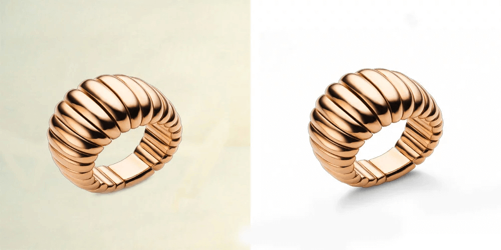
For example, drop shadows are subtle and can be created during the shoot or in post production. Look at the difference between this jewellery product picture with and without a drop shadow.
Here’s a handy guide to adding drop shadows using photoshop if you didn’t manage to get them during the shoot.
And you can play with all types of lighting and shadows:
- Natural shadows are created from using a natural light source such as the sun through a window.
- Reflective shadows can be made by using a reflective surface under the product.
- Cast shadows can be produced in a variety of ways in your photo studio.
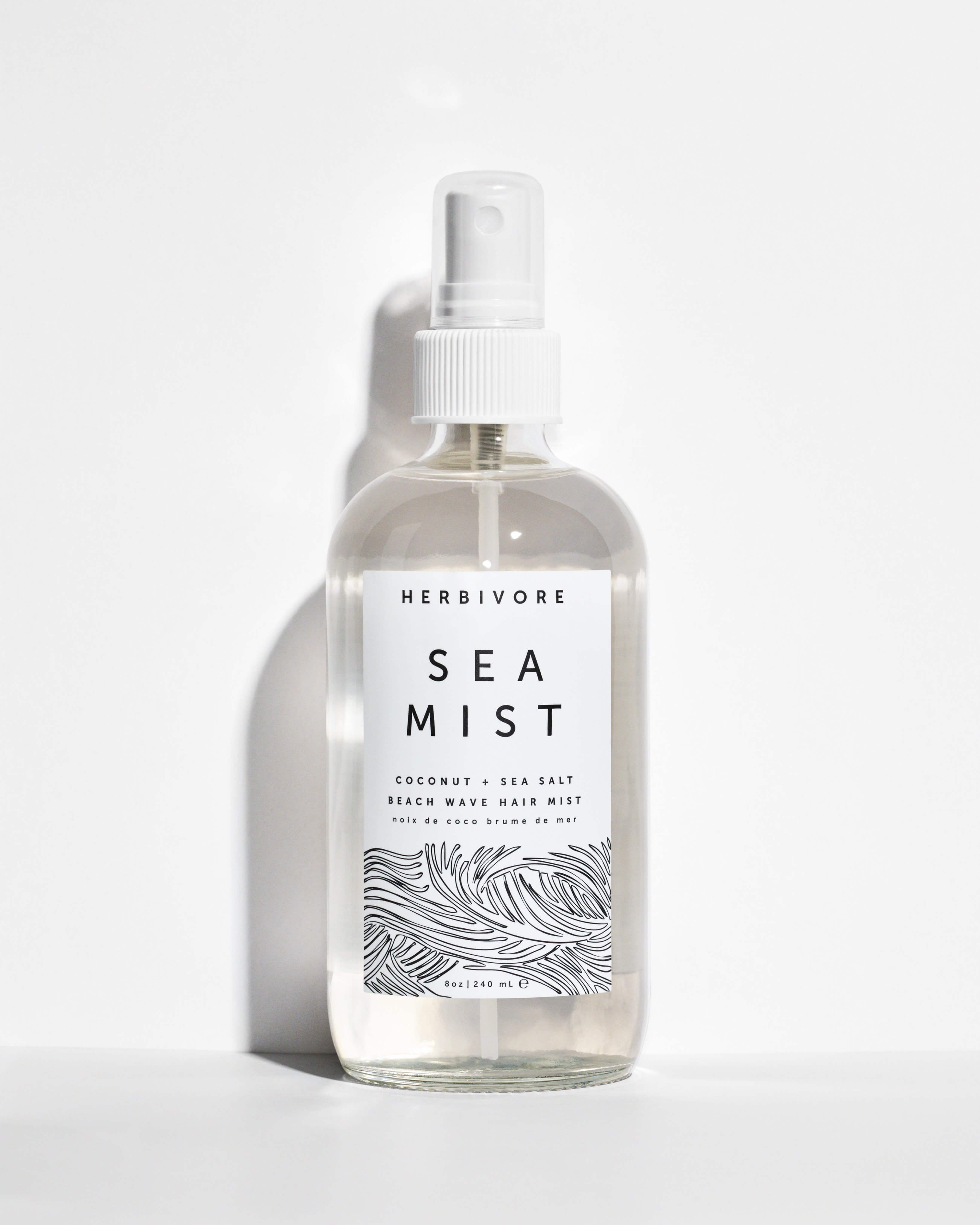
Here’s a simple yet effective product pic from the Shopify store herbivore botanicals that uses natural lighting. The look really fits their identity as a brand that uses natural products.
The creative use of cast shadows in this product photo for beauty brand Prescription Lab give it a real energy.
Explore these options to find the look that best fits your product and site. Only you know your goals for BFCM, but the lightning and shadow of your product images should serve them.
Angles and views
Showing multiple views of your product will significantly improve your conversion rates. They will help your customers understand the size and shape of the product, and help them better visualize the product as a whole.
To complete the visualization, make shots of the front, back, diagonal, bottom, top, and interior, and then any details of the product available. Imagine what your customer might want to know about such a product. But don’t overwhelm the shopper with too many images. Instead, use enough that the customer can truly understand the product. This range of angles for a pair of high heels provides just the right number of perspectives for the user to get a full idea of the product.
Color
Color is another important feature during the online shopping experience. You should make sure your images show the correct color in order to show your customers exactly what they are getting. This will reduce returns (which are notoriously high over the BFCM weekend).
Don’t forget that different computer screens and even different web browsers have a different color profile. This means that every screen and browser interprets colors slightly differently. To deal with this, I recommend you change your .jpeg files to the sRGB color profile.
This image illustrates the browser problem perfectly, showing how the same image could appear in different browser depending on whether it uses the sRGB color profile or not.
Background
Background is another important factor to consider when creating your online product images. For most products a plain white background is most suitable -- clean and plain is usually key. I recommend using the same background for all your products to add consistency and professionalism to your site.
Props
Occasionally the use of props can be a useful addition to your image, especially if you need to show the functions of a product or the size of it. And, as mentioned above, BFCM may feature seasonal or other products that beg for such additions.
However, make sure any prop does not draw attention away from the product, and only consider them in one picture of the series. For example, a useable clothing accessory might benefit from a single picture on a model.
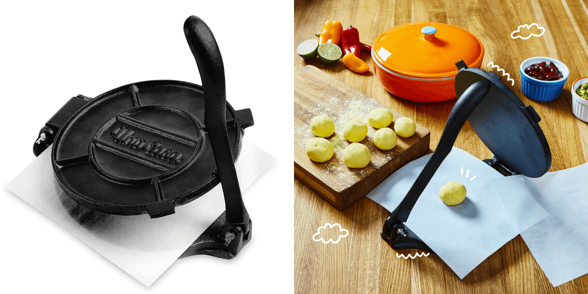
The Shopify cookware store UnoCasa does a nice job of showing the product both individually, and with props in a real life context.
This gives an excellent idea of how the product will feel to use and how much space it will take up, key factors when purchasing an item like this tortilla press.
Step 2: Optimizing your images for your Shopify store
Once you’ve got the images ready, getting them up with the right size, zoom functionality, alignment and margins is equally important.
File type and file name
Shopify recommends using JPEG for product images, pages and blog posts, and PNG for decorative images such as logos, trims and borders (these should be in your CSS code, not HTML, so this shouldn’t have a big impact on page load times).
Shopify also accepts .gif images, but these are very low quality. They should only be used for small images that won’t be enlarged.
With image file naming, the most important point is to give the image file a specific name. Aim to be descriptive and include keywords that may be relevant. Don’t forget, Google will be looking at image file names to work out what search terms your page would be a good result for.
Alignment and margins
Just as with the background of images, having the same alignment and white margin on images creates visual consistency, and results in a better shopping experience. In short, a clean professional look shows you are a professional seller.
Zoom
As mentioned above, you want your customer to be able to visualize the product, and so it’s important to be able to zoom in on the item to see the details that set your product apart. However, if you can’t install a zoom function, make sure you have more close shots of the interesting details on their own.
Size
Finally, it’s important to make sure your pictures have a proper size to achieve great quality, high resolution images that can be clearly viewed and zoomed. In general, your images should be at least 2000 pixels on the longest side so that you will be able to utilize a zoom functionality on your images and still see the important details.
For uploading to Shopify, your image can be up to 4472 x 4472 px, and up to 20 megapixels. For square product images, Shopify recommend 2048 x 2048 px. You will need to have over 800 x 800 px for zoom functionality to work.
Concerning file size, Shopify will already compress your images a bit and also takes care of thumbnails on your checkout pages.
This is a helpful start, but you should always be looking to further compress your images using TinyIMG to get your load speed as fast as possible. Don’t forget, slow load speed can harm both your sales and your SEO. Offering a fast and smooth online experience will enhance overall customer satisfaction.
Aiming for file sizes of 70KB or lower is a good general target, though this may depend on the quality of image you need.
And on the topic of SEO, there is another critical step when creating images – writing alt attributes. Along with the file name, alt attributes are what Google uses to understand what is shown in an image. It will also use these texts when returning Google Image search results.
They are texts that serve as a replacement to the image themselves, either because it hasn’t loaded yet, or for visually impaired internet users. There is an alt tag, which is essential to include for SEO, and an alt title.
Alt titles are not essential. They will only be visible to people using a mouse or pointing device – the title text will show up if the cursor is hovering over the image. However, Alt tags will show if the image hasn’t loaded yet, and will also be read out loud by accessibility software used by people with visual impairments. These will also be read by Google.
You can find a step by step guide to optimizing your Shopify images here.
Time to get snapping
The Black Friday Cyber Monday weekend is literally the busiest shopping weekend of the year. And to get the most out of it, the product images you display should be the best they can be. So, remember to follow these key principles when creating your images:
- Identity your goals for the period, imagine what your intended audience will want to see and produce the best images according to those goals and shoppers.
- Shadows, angles, color, background and props can all affect the final image, so bear these points in mind when photographing your products.
- And don’t neglect the final presentation of your images, making sure that the size, zoomability, alignment and margins all work in favor of your campaign.
