A good heading structure is crucial if you want to enhance your SEO efforts by helping search engines understand your page content better. It’s also useful for your readers who can scan the text easier when it’s organized.
Using the free TinyIMG extension, you can quickly review the heading structure of any page. It can help you identify common issues, such as overuse of headings, multiple H1s, and more.
In this article, we’ll teach you how to improve heading structure to enhance SEO by analyzing pages with TinyIMG. You’ll also learn common heading structure mistakes and how to add headings to Shopify.
Analyze heading structure, landing page metadata, Core Web Vitals, schema markup, images, and other page details with one extension
Try TinyIMG freeWhy are headings important?
Headings are guiding points that help users understand the text better. Here are some important reasons why using headings is important:
- Improves SEO. Using headings helps search engines understand the content or context of your web page better. In turn, this can help your page rank higher in search engine results.
- Demonstrates good structure. Headings help create a clear structure, ensuring it’s easy to read or scan for your page visitors.
- Enhances accessibility. Screen readers use headings to read, navigate, and skim the text. This is especially useful for visually impaired or blind users who read your site.
How to structure headings with TinyIMG
TinyIMG can help you notice issues with your heading structure that you didn’t notice or haven’t thought of before. This can be multiple H1 sections, non-hierarchical heading level order, and more. So, let’s take a look at the most important heading levels and how to structure them with TinyIMG:
Heading 1
The first-level heading, or H1, is the most important one on the whole website. It signals to search engines and readers what the entire page is about.
There should be only one H1 heading on the whole page, and it should be placed as the first heading of the page.
The easiest way to check your H1 structure is by using the TinyIMG extension. It shows you what the H1 is called and where it’s placed.
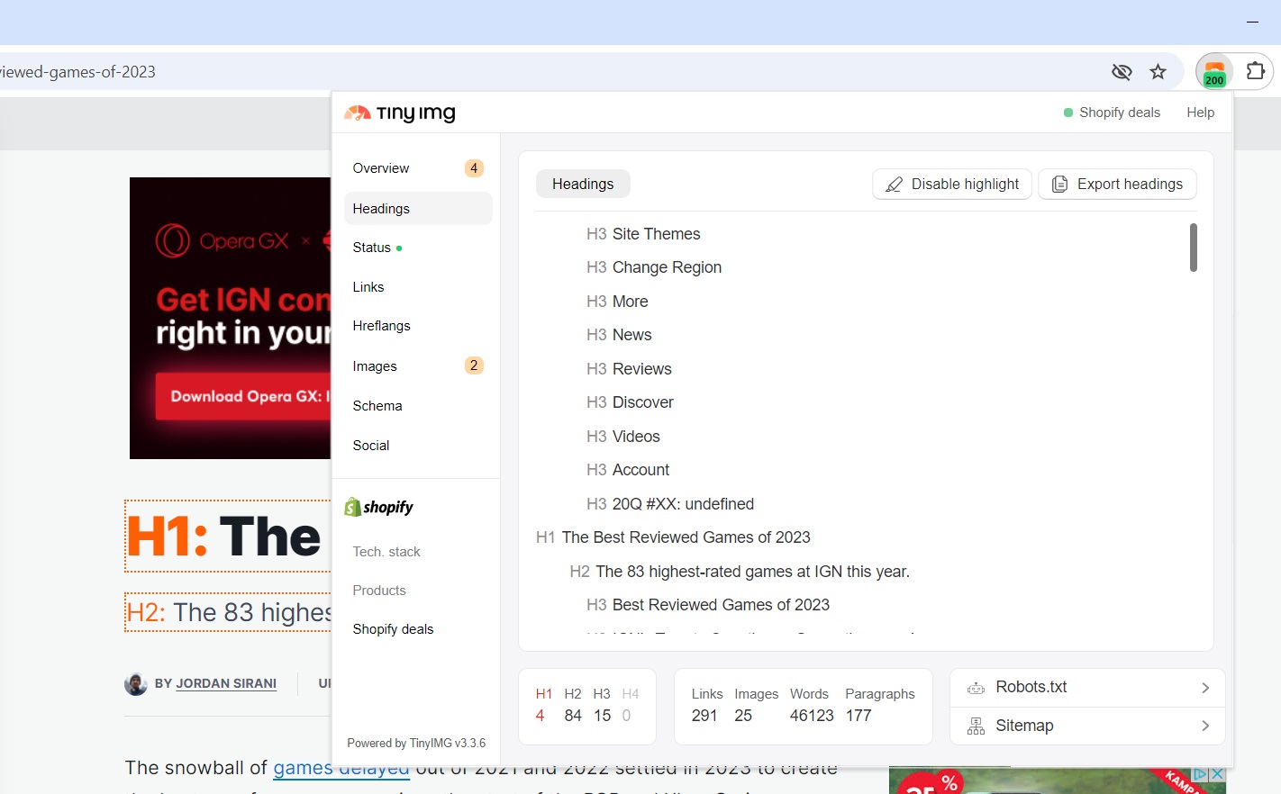
Let’s take IGN’s “The Best Reviewed Games of 2023” article as an example:
As you can see, TinyIMG highlights headings so you can identify them more easily and understand the whole page structure.
The extension also marks the H1 count red because the article has 4 first-level headings. This can confuse search engines about which heading is the main one that describes the whole article.
Heading 2
H2 (second-level headings) are sections that cover the main points of H1. There is no limit as to how many H2 sections can be included in the content, but it should be done in moderation.
Some sites use Heading 2 for different types of text sections on their website, such as buttons, menu items, comments, and more. However, the same sections can be written as simple text as they don’t add much value to the content and can ruin the hierarchical structure.
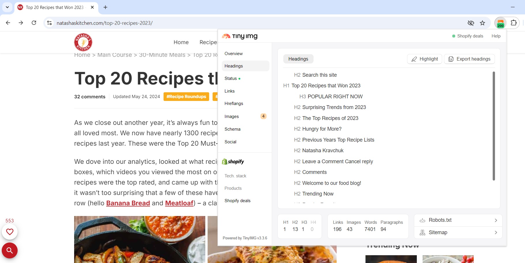
The free TinyIMG extension helps you analyze which H2 sections aren’t a part of the content. For instance, here’s an example of an article called “Top 20 Recipes that Won 2023” by Natasha’s Kitchen:
The page uses Heading 2 for sections that aren’t the actual content but rather the function of the site, such as the “Search this site” note before H1. Meanwhile, recipe names are written in simple text instead of H2 or H3.
Heading 3, 4, 5
Heading 3 as well as further level headings (heading 4, 5, 6) serve as sub-sections of the previous heading. They should be placed in descending order to ensure content is easy to comprehend for search engines and readers.
With TinyIMG, you can review the headings one by one and improve the overall heading readability. Place yourself in the position of the reader who is looking at your headings only and ask yourself if the structure makes sense. If you find which points can be improved, adjust your content accordingly.
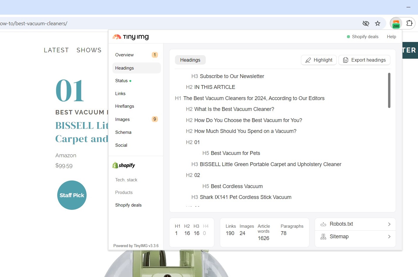
As an example, let’s take a look at the Drew & Jonathan’s article “The Best Vacuum Cleaners for 2024, According to Our Editors”:
The writers are using a complex structure that doesn’t follow a hierarchical order. For example, they use H2 to write the number, then H5 to name what the product is best for, followed by H3 with the product name.
This can not only be confusing for visually impaired readers with screen readers, but it can also affect SEO. Search engines may not understand the structure because it doesn’t follow a logical order and H2 is used for simple numbers.
With this in mind, writers could change the structure by simply leaving one H2 section like this: “1. BISSELL – best vacuum for pets.”
What insights does TinyIMG give for heading structure?
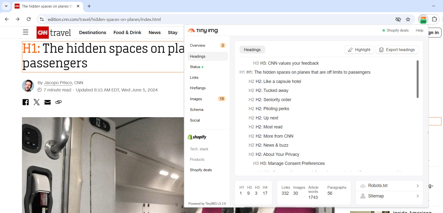
The TinyIMG extension provides you with the full heading structure of your entire page. It shows the levels of each heading you placed on the site, and you can even highlight them to identify their position faster.
Additionally, you can export headings of any page, whether it’s from your or a competitor’s website. You can use it to analyze competitors or your own page data and improve content accordingly.
Here are some other heading data you can check on the TinyIMG extension:
- Heading count. You can see how many headings of each level there are on the page. If there’s more than one H1 present, the section will be marked red.
- Link count. Checking how many links your page has can help identify if there are too many or too few. While there’s no one ideal number, Google Search Central says “... if you think it's too much, then it probably is.” Links help build link equity, but too many can negatively affect SEO.
- Image count. Knowing the number of images on your page can help you analyze if they’re all effective and necessary. Too many images can affect page load speed, but if optimized and used properly, they can also enhance SEO by providing better readability and reader engagement.
- Word count. Knowing your content word count can aid with understanding if your content ensures depth and is optimized for target keywords. While there’s no optimal word count, many offer to stick to around 2,400 words. Meanwhile, Backlinko found that 3000-word articles get around 77% more backlinks.
- Paragraph count. You can check how many paragraphs your page has with TinyIMG. They help organize the content to ensure better flow. Additionally, the shorter the paragraphs, the easier it is for readers to scan the text.
How a good heading structure should look like
A good heading structure is one that puts headings in a hierarchical order. The whole content should start with Heading 1, and there should be only one first-level heading available throughout the whole page.
There should also be multiple H2s that separate your content into the most important parts. If you need further elaboration, or text under heading 2 becomes too long, you can divide it further into H3, H4, and so on.
With all of that in mind, here’s an example of what a good heading structure could look like:
H1: Best vegetarian recipes to try in 2026
H2: Sweet potato steaks
H3: Ingredients
H3: Instructions
H2: Spicy Asian Zucchini
H3: Ingredients
H3: Recipe
H2: Conclusion
Note that buttons, header elements, and other section text don’t necessarily have to be made as headings simply because you need bigger or bolder text. Utilize the text editor in Shopify and change the text size and format of simple text when possible.
How to add headings on Shopify
Adding headings to your Shopify store is a straightforward and easy process. Here’s a step-by-step guide on how to add headings of any level:
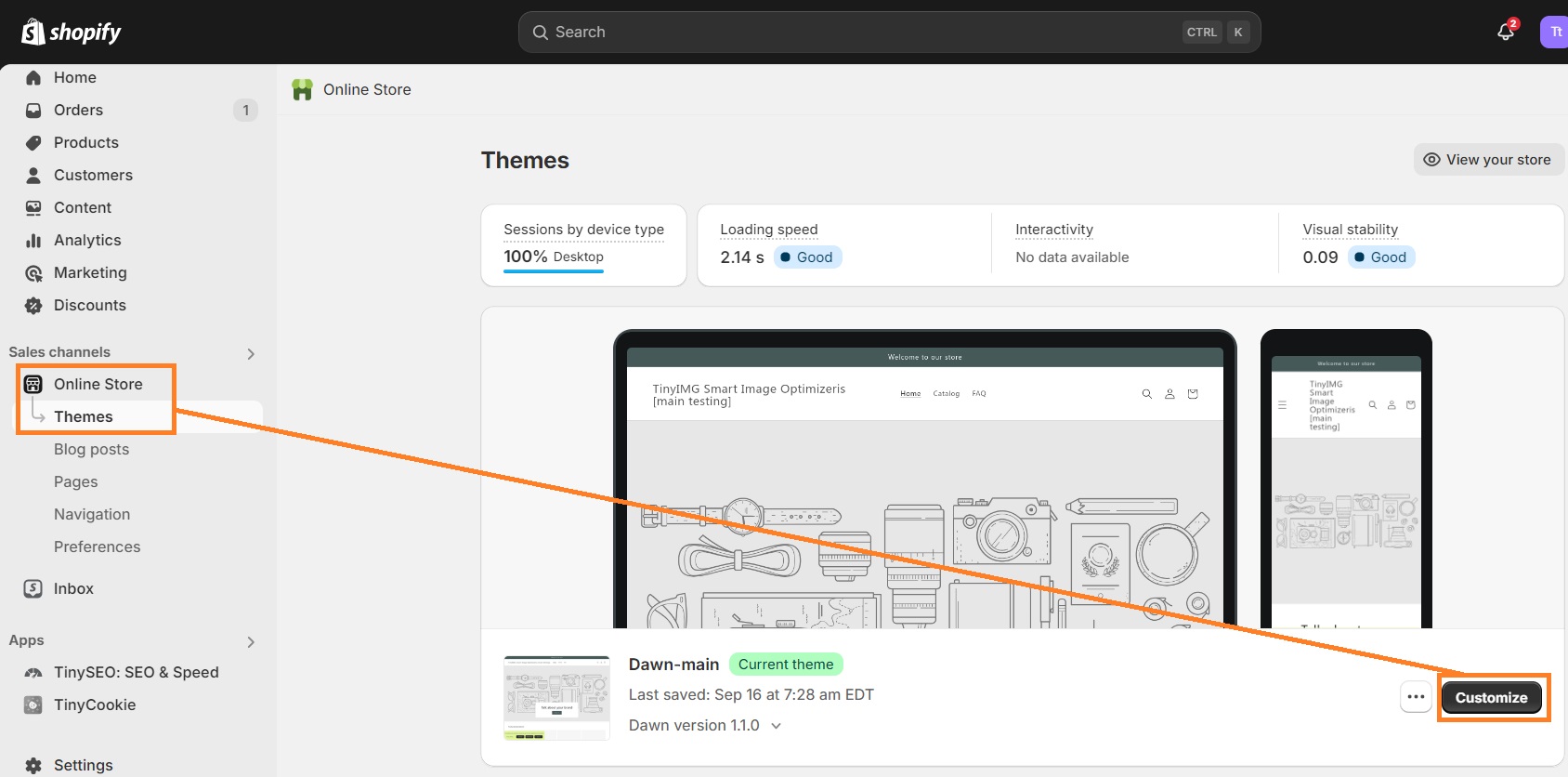
1. Go to your Shopify Admin dashboard, click the Online store section, and press Customize by the theme you want to edit.
2. Select the section where you want to add a heading.
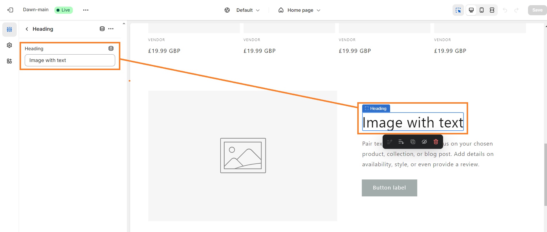
3. You can add H1 in the Heading section or you can use the Text field and click the “Aa” button to add H2 or any other level heading.
4. Click Save.
Conclusion
To ensure a good heading structure, it’s important that a page includes only one H1, follows a descending heading level order, and doesn’t put simple text sections as headings. With the free TinyIMG extension, you can quickly identify these issues and take action or even analyze competitor pages.
It’s important to note that TinyIMG helps more with SEO than just analyzing headings. It also lets you review landing page metadata and Core Web Vitals, get link insights, check image details, and identify other common SEO issues. The best part – you can get it completely free.

Frequently asked questions
Headings should be put in descending order, meaning there should be one first-level heading (H1), followed by sections (H2), and subsections (H3). Don’t make the mistake of placing different level headings anywhere you want, for example, H3 before H1. This can cause confusion to search engines or screen readers.
You can add a heading of your choice on the Home tab of Microsoft Word. Simply mark the text you want and choose the heading level in the Styles gallery. You can customize the style of your heading based on your needs.
Headings should be properly formatted and structured sequentially. Titles, headings, and subheadings should all be written in sentence case (capitalizing the first word only) unless there are item titles, names, or other words that are generally capitalized.
Headings signal to the reader and search engines what the following content is about. They present the key concepts and make long texts look more structured.

