 10 min read

Choosing the right image sizes helps ensure your pages are organized and ensure fast load times. The exact best image size depends on where the image is placed. For example, a hero image on the homepage will be much larger than a blog post or product image.
Sizes also differ based on the device. Mobile screens naturally need much smaller image sizes than desktop devices.
In this guide, we’ll break down the best image sizes for websites that are relevant in 2026. You’ll find out the recommended image dimensions, aspect ratios, resolution, file size, and formats to use for any case.
Key highlights:
Websites should generally aim for an image width between 1280-1920 px while keeping the file size under 200 KB to ensure optimal page speed.
Use 16:9 or 3:2 aspect ratios for standard landscape images, and 1:1 for square photos to get the best results. In terms of resolution, keep it at least 72 PPI (pixels per inch) at a minimum.
For blog images, 1200 x 630 pixels is a common choice, while rectangular logos are 250 x 150 pixels, and large visuals like hero images are around 1280 x 720 pixels.
Generally recommended image sizes for websites
The most popular desktop resolution is 1920 x 1080 pixels according to GlobalStats. So, I prepared a cheat sheet with standard image sizes for websites best suited for this resolution:
|
Website image type |
Image dimensions (weight x height) |
Image aspect ratio |
|
Background image |
1920 x 1080 pixels |
16:9 |
|
Hero image |
1280 x 720 pixels |
16:9 |
|
Website banner |
250 x 250 pixels |
1:1 |
|
Blog image |
1200 x 630 pixels |
3:2 |
|
Logo (rectangle) |
250 x 150 pixels |
3:2 |
|
Logo (square) |
100 x 100 pixels |
1:1 |
|
Favicon |
48 x 48 pixels |
1:1 |
|
Social media icons |
32 x 32 pixels |
1:1 |
|
Lightbox images (full screen) |
1100 x 800 pixels |
16:9 |
|
Thumbnail image |
150 x 150 pixels |
1:1 |
While image dimensions are important, a smaller image file size can make a difference in your page weight, ensuring faster loading times. You can easily compress your website's images for free using tools like the TinyIMG online image compressor.
Common website image ratios
Before you decide on image dimensions to use, there are also common aspect ratios used for specific image types. Here are the main ratios and what they’re used for:
- 1:1 square – most commonly used for logos, icons, thumbnails, product images, and social media posts because it fits on both desktop and mobile devices without cropping.
- 16:9 landscape – used for hero images and large background images because it usually matches modern desktop or laptop screens. Usual sizes are 1920×1080 px and 1280 x 720 px.
- 3:2 rectangle – often used for blog post images because they keep the layout balanced. Usual sizes are 1200 x 630 px.
- 9:16 portrait – great for large mobile website background images or Instagram story ads. The full-screen resolution is 1080 x 1920 px.
Website image guidelines for 2026
Image sizes greatly influence the user experience, Search Engine Optimization (SEO), and overall website performance. Irrespective of the type of image file used, the key to a great website is the size of the images.
Here is a detailed overview of the guidelines for general image size specifications across websites:
Website logo size
Standard logo sizes range from 250 to 400 px in width and can be square (1:1) or rectangular (3:2). For example, for a 250 px width, a 150 px height is recommended. Since logos require transparency, you should use the PNG format.
- Dimensions – 250 x 150 pixels (rectangle) or 160 x 160 pixels (square)
- Aspect ratio – 3:2 or 1:1
- File size – under 200 KB
- PPI – 72
If you don't have a logo yet, you can create a basic version using one of the best online logo makers.
Website favicon size
The most popular size for a favicon is 16 x 16 px and a 1:1 aspect ratio. However, Google Developers recommend a size larger than 48 x 48 px (like 32 x 32 px or 96 x 96 pc) for favicons so it would look good on all devices.
- Dimensions – 16 x 16 pixels, 32 x 32 pixels, or 48 x 48 pixels
- Aspect ratio – 1:1
- File size – under 100 KB
- PPI – 72
Website thumbnail size
A common size to use with website thumbnails is 150 x 150 px with a 1:1 aspect ratio. However, the size can vary depending on its placement. For example, product image thumbnails can reach 300 x 300 px, so consider your website’s design.
- Dimensions – 150 x 150 pixels or 300 x 300 pixels
- Aspect ratio – 1:1
- File size – under 2 MB (ideally around 500 KB)
- PPI – 72
Website banner size
Website banners can have a different size depending on their purpose and placement. Common banner ad sizes are leaderboard (728 x 90 px), wide skyscraper (320 x 50 px) and medium rectangle (300 x 250 px), but you’ll have to check with the ad platform.
Meanwhile, desktop banners can range up to 1600 px in width and 500 px in height.
- Dimensions – 1600 x 500 pixels
- Aspect ratio – various
- File size – under 1 MB
- PPI – 72
Website background image size
The recommended size for website background images is 1920 x 1080 pixels and no more than 200 KB in file size. As long as the pixels per inch (PPI) value is at 72, you can upload a background image size of up to 2560 x 1440 pixels or 16:9 aspect ratio.
- Dimensions – 1920 x 1080 pixels or 2560 x 1440 pixels
- Aspect ratio – 16:9
- File size – under 200 KB
- PPI – 72
Website hero image size
The ideal size for a website hero image (full-screen) is 1280 x 720 pixels at an aspect ratio of 16:9. However, depending on the site’s design, it can be up to 1800 px in width. Also, maintaining a 72ppi will provide both clarity and a small file size for hero images.
- Dimensions – 1280 x 720 pixels
- Aspect ratio – 16:9
- File size – under 200 KB
- PPI – 72
Website blog image size
Blog images nest well on a website at a 3:2 aspect ratio or 1200 px by 630 px. Meanwhile, featured blog images in portrait format are best sized to 900 px by 1200 px. The ideal file size should be below 100 KB.
- Dimensions – 1200 x 630 pixels
- Aspect ratio – 3:2
- File size – under 100 KB
- PPI – 72
Mobile image size recommendations
Most popular eCommerce website builders offer responsive designs that automatically adapt images you upload on desktop for mobile screens. But for custom built sites, it’s important to choose the proper sizes so that images don’t get distorted on mobile.
Here are some recommended image dimensions and ratios specifically for mobile devices:
- Background image – 360 x 640 px (16:9)
- Hero image – 360 x 200 px (16:9)
- Website banner – 360 x 120 px (3:1)
- Blog image – 360 x 640 px (3:2)
- Logo – 160 x 40 px (4:1 aspect ratio) or 60 x 60 px (1:1)
- Favicon – 16 x 16 px (1:1)
- Social media icons – 48 x 48 px (1:1)
- Lightbox images – 360 x 640 px (16:9)
- Thumbnail image – 90 x 90 px (1:1)
Images with an aspect ratio of 1:1 will have no problem displaying on mobile devices. However, depending on the automatic resize setting, some cropping may occur on mobile devices for images with aspect ratios of 16:9 or 3:2. For this reason, the safest approach with responsive images is to keep the focus area of the subject in the middle.
Why is image size important for websites?
Website image size is important because it helps improve performance, image SEO, and user experience. Here are the main reasons why choosing the correct image sizes matters:
- Faster page performance. Oversized images can reduce the page load time, while images with wrong dimensions can cause unexpected layout shifts. All of this can contribute to higher bounce rates and a detrimental user experience.
- Improved SEO. Since images make up around 22% page weight according to research by Web Almanac study, they can drastically affect website speed. Since speed is a ranking factor on Google, correct image sizes can help improve SEO.
- Mobile-friendliness. Picking the right sizes for website images helps make them look responsive on all devices, including mobile.
- Reduced resource usage. When you pick the right image dimensions instead of placing an oversized image on your site, you save up storage and bandwidth. Considering hosting plans come with resource limits, proper image sizing can help lower hosting costs.
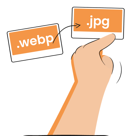
What image format to use for the web?
You should use the WebP format for general web images because it offers a smaller file size at the same quality compared to PNG or JPEG. Google Developers found that WebP offers a 25-34% smaller image file size than PNG or JPEG files of similar quality.
JPEG images are usually saved using lossy compression, meaning it usually reduces the file size by removing some data. At the same time, PNG is used with lossless compression to retain high quality. PNG images have a higher file size, so I’d only recommend using it for images that need excellent quality, like logos.
You can find the most common image formats and their use cases in the table below.
| Format | Best for | Pros | Cons |
| WebP | General website images (most used) |
|
|
| JPEG | Photographs, general web images |
|
|
| PNG | Transparent images, like logos |
|
|
| GIF | Short animations |
|
|
| SVG | Illustrations, icons, logos |
|
|
Other image optimization practices
Aside from ensuring the proper image dimensions, you should also compress images to reduce the file size and follow the best image SEO practices. It helps ensure that your images don’t negatively affect your page performance and that search engines can better understand your image content.
Image compression
Image compression is the process of reducing the file size without changing image dimensions. When an image is compressed, similar pixels that make up the image are grouped and condensed using software like the TinyIMG image compressor. Any hidden metadata, like camera details, is also removed.
Compression helps lower the page weight, influencing faster page load times. This also affects bounce rates, since Google found that even a jump from 1 to 3-second load time could increase them by 32%.
Image compression tools usually rely on lossless compression, meaning it doesn’t delete any data, so you can’t even notice a visible drop in quality.
Image SEO optimization
Optimizing your images can also contribute to higher SEO rankings. Ensuring your images are properly sized can lead to better page speed, which Google considers a ranking factor.
Plus, unique images with proper file names and alt texts can end up in image search results for certain queries.
Here are some of the image SEO and performance optimization tips:
- Create unique and original images – creating unique infographics or photographs instead of using stock images shows search engines like Google that your images are valuable. They have a better chance of appearing in image search results.
- Generate proper alt texts – alternative texts are short but clear descriptions of the image content that tell search engines and AI systems what your image displays. For example, instead of writing “black shoe,” try being more descriptive, like “black leather shoe in a white background.”
- Create clear file names – image file names should also be descriptive because search engines rely on text signals to understand images. Instead of names like “IMG_54354.jpg,” you can write what the image shows, like “white-summer-dress.jpg.” Just make sure to use hyphens to separate words.
- Generate an image sitemap – XML sitemaps work as roadmaps for search engines to understand and find your website structure and pages. You can either add image sitemap tags into an existing sitemap or create a separate image sitemap. For example, Shopify adds image tags to the sitemap automatically.
Platform-specific image size recommendations
Image sizes depend on your website design and the platform you’re using. For example, particular sizes may be recommended for WordPress, Shopify, Wix, Squarespace, and other platform themes, while custom-designed sites may have other recommendations.
While finding the image dimensions for a website can seem daunting, here are some tips to help you find the image sizes for standard website platforms:
Shopify themes
- Shopify allows users to upload images of up to 5000 x 5000 pixels, with a limit of 20MB per image at 72 dpi.
- Product images can be up to 5000 x 5000 pixels, but the recommended size for square photos is 2048 x 2048 pixels.
- Check if your Shopify theme comes with a guide to the recommended image sizes.
- You can review the full Shopify image size recommendations in our guide.
 Image compressorBulk alt text editor
WordPress themes
- The recommended image size in WordPress is up to 1024 x 1024 px.
- Most WordPress themes have a full documentation file that helps users find the best image sizes for the theme.
- Featured images usually come with a 16:9 aspect ratio, like 680 x 382 pixels.
Squarespace themes
- The ideal width for most website images is 2500 px.
- Squarespace recommends using images of 500 KB or less.
- Image resolution has a 120 MP (megapixel) limit.
Custom websites
- A custom-built website developer usually provides documentation that outlines the best image sizes – check with them for more information.
Summary
Finding the right image sizes for your website can be challenging, especially across multiple screen sizes. Different themes or custom-built sites have different guidelines on what works best, but the general recommendations are similar.
Content images should be around 1200 pixels in width, logos can be square or rectangular from 250 to 400 px in width, and banner ads have custom sizes based on the ad platform.
If you have a large website with hundreds of images, managing their sizes manually can be difficult. In such cases, we recommend using a third-party image optimization app. For example, Shopify users can leverage TinyIMG to automatically resize oversized images when detected.

Frequently asked questions
For most images, you should aim for the file size to stay under 500 KB. Meanwhile, icons, logos, and other small images should ideally be under 100 KB. Maintaining small sizes helps ensure that they don’t impact your website speed.
Using another page’s images can harm your SEO efforts if you’re unauthorized to use it. The website can give you a takedown notice or report you to Google for copyright infringement. However, if you have permission to use it and have optimized it according to best image SEO practices, then your SEO won’t be harmed.
Websites don’t follow a single size but instead adapt to different screen resolutions. For desktop, the most popular resolution is 1920 x 1080 px. Meanwhile, on mobile, it can be between 360 x 640 px and 414 x 896 px.
A 1920 x 1080 website is 1920 pixels wide and 1080 pixels tall – a size for a full-HD monitor. It uses a 16:9 aspect ratio.
HTML pages don’t have a single fixed size, but there are commonly used widths that designers follow for different devices:
- Desktop: 1280-1920 px
- Mobile: 360-480 px
- Tablet: 768-1024 px