Providing your shoppers with a smooth browsing experience will keep them engaged and motivated to buy from you. Shopify responsive images play a major role in making your store’s pages inviting and functional.
Responsive images adapt to the user’s device size, improve your Shopify store mobile optimization and provide a wholesome user experience.
We want to help you get a better understanding of Shopify responsive images. That’s why we will dive into what Shopify responsive images are, the importance of making your images responsive, and how you can set up optimized images on your Shopify store.
Improve your Shopify store speed and SEO performance with one app!
Install TinyIMG todayWhat is a responsive image?
Responsive images are visuals that load properly on any device regardless of screen size, resolution, orientation, page layout, and connection. That means images are not stretched, cropped or otherwise incorrectly altered to fit the screen.
Shopify responsive images are set up with a set minimum size range and automatically resized based on the device used to view them. As such, responsive images have a massive impact on user experience, ensuring that a webpage doesn’t break from an unoptimized and rigidly set image dimension.
How do Shopify responsive images work?
Responsive images automatically adjust to fit the size of the screen and load quickly, providing a better experience for shoppers across different devices.
Let's say that you've uploaded an image to your Shopify product page and set specific dimensions that look good on the desktop. Needless to say, shoppers on mobile will not have a pleasant experience because they will see a distorted image.
However, if you make your images responsive, these images will adapt to the device the shopper is using.
Shopify responsive images are defined using these features:
- image_tag - creates an HTML <img> tag for a CDN image_url
- srcset - defined a set of images to choose from and what size each image is
- sizes - defines a set of conditions, usually screen widths, and indicates which image size would be the most appropriate for which screen
Tip: you can also use srcset and sizes to enable resolution switching. That way, smaller resolution images will load for smaller screen sizes and improve page load time.
Best scale and size for image responsiveness
The size and scale of your images depend on the shopper's device. For the best results, upload the highest quality image you have within the 20MB or 20-megapixel limit but at 72dpi.
When possible, avoid defining exact dimensions. Instead, define percentages to ensure your image scales to the relevant screen size.
To ensure that good image resolution doesn’t impact your site speed, use TinyIMG to auto-optimize your images and keep your resolution intact.
Best image scale for mobile
The best image resolution for most mobiles is 640 by 320 pixels. You can use images with a lot bigger dimensions and scale them down, but mobile devices will have to process the larger image regardless, causing potential performance issues.
In terms of best practices for your image sizing, the average JPG is 29KB and the average PNG is 16KB. These sizes are recommended to ensure that you have optimized images for mobile devices.
Best image scale for desktop
Since your images will open within a full-screen (unlike smaller smartphone screens), size your image width at 1500-2500 pixels and leave the other dimension value to be automatically generated.
Benefits of setting up responsive images on a Shopify theme
Shopify responsive images can do a lot for your website performance and UX.
Here are the improvements you can expect when you implement responsive images on your Shopify store:
1. Enhanced speed
Responsive images will reduce customers' time to wait for the page to load. The smaller the screen, the less time it will take to load the webpage.
The same logic applies to the image file sizes, which means that the file size may significantly influence your Shopify website's speed.
At first sight, this may not seem like such a big deal. Yet, from the customer’s perspective, loading speed is one of the key considerations voiced by online users. According to Google, websites that load slowly experience a 20% decrease in traffic per additional second of waiting time.
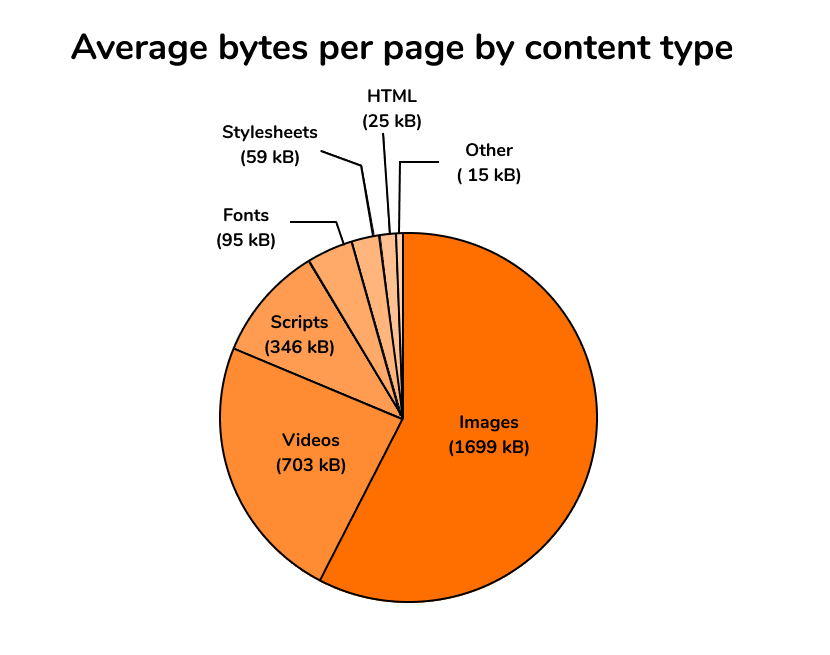
Of course, more than 50% of a website's content consists of various pictures for the most part. However, if you are struggling with improving the website's loading time, you need to reduce the file size of images before making them responsive.
2. Better your search engine rankings
Google's algorithm uses factors like site speed to determine search engine rankings. Since responsive images improve site speed, they contribute to your overall SEO strategy and ensure you’re doing everything you can to get top spots on Google search pages.
However, you must take care of proper image indexing. You don’t want Google indexing lowest resolution images or, even worse, all images with differently defined dimensions. It’s a waste of valuable crawl budget that could be spent on more relevant resources of your website.
3. Optimal UX experience
Shopify responsive images are vital in front-end development. It enables both merchants and marketers to provide the best experience to online users.
It’s possible due to the ability to have your images supported by all kinds of screen devices. In turn, it gives you a chance to offer a multi-device experience. Customers will be able to access the website that looks similar no matter the device used to access it. This can help to produce brand credibility and trust, eventually leading to more conversions.
The best image size for Shopify is 2048 x 2048 pixels. This ensures that the image is big enough to view and look at closely but not too large that it affects the page load speed.
Read the complete step-by-step guide on how to optimize images on Shopify.
4. Increased e-commerce conversions
Responsive images are essential for those running their Shopify websites. Especially now as more and more customers are making their e-commerce transactions on their smartphones.
Although, you need to remember that online users prefer using services that they can access and navigate promptly. This may be challenging for websites that require a lot of images. That's why you need to opt for responsive images, as they can improve the loading time and become a key factor for producing significant conversions.
That said, responsive images can deliver various benefits that could help you to boost your business and the overall performance of your Shopify website. Yet, as we have put the record straight on the strengths of responsive images, we need to discuss its negative aspect.
Bottom line
Making your Shopify images responsive is crucial to deliver a great experience to customers and optimize your on-site to increase conversions. We hope this guide helped you understand why you need Shopify responsive images and how you can set them up.
TinyIMG is an app you need to maintain high-quality images that don’t slow down the rest of your site. This Shopify app can help you maintain image quality, auditing and optimizing your store's SEO. On top of that, this app has an advanced image reduction, meaning your images will be resized to smaller sizes alongside optimization. TinyIMG preloading function will allow you to tell the browser about the order of images you want to load first.

Frequently asked questions
No. Whether an image is responsive or not depends on the theme you have installed and how it's developed. That's why certain images can sometimes require manual editing. Also, keep in mind that apart from different sizes, desktop and mobile screens have opposite orientations as well.
You can make a Shopify image responsive by using image_tag filter. It’s a technical process, but you can learn how to add this filter to your images with this Shopify dev guide.
Yes. All of Shopify templates are adapted to multiple screens including mobile.


