In eCommerce, every section on your Shopify storefront can influence customer decisions. Optimizing your Shopify sections isn't just about tweaking designs. It’s about improving content, removing friction, optimizing visuals, and more.
However, it can be difficult to know where to begin. So, in this guide, we’ll dive deep into Shopify sections and how you can optimize them to maximize your conversion rates.
What are Shopify sections?
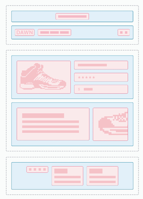
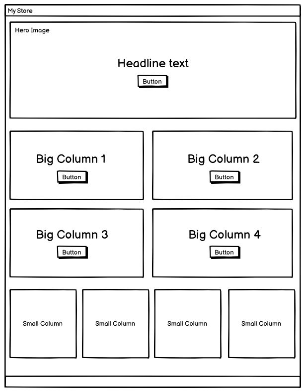
Shopify sections are the building blocks of your Shopify storefront. Each section can be independently configured to display various types of content such as images, products, text, or even videos.
Source: Shopify
You can add, remove, or reorder blocks in the Shopify theme editor without any need for coding. The sections are made to be flexible by the section schema, which defines the settings and styles that merchants can adjust. This includes changing the background color, adjusting text alignments, adding new content blocks, and more.
The way you use Shopify sections can greatly impact how customers see and use your store. The better the design and the clearer the user path, the more conversion rates you can expect.
Examples of effective Shopify sections
Many Shopify sections are impactful and can help increase your conversion rates if used correctly. Let's consider a few examples:
- Homepage carousel. Many great Shopify store examples use a carousel section at the top of the homepage to showcase featured products or current promotions. This section often has many blocks, each featuring different products or offers.
- Featured products. This is a section dedicated to featured products that allow merchants to spotlight new arrivals, bestsellers, or items on sale. This section uses a grid layout and lets stores display many products at once. Each product has its own block, including images, pricing, and a quick add-to-cart button.
- Testimonials. Incorporating a section for customer testimonials can greatly enhance credibility and trust. This part usually has text blocks with customer feedback and ratings. It can help convince new visitors of your products' value and quality.
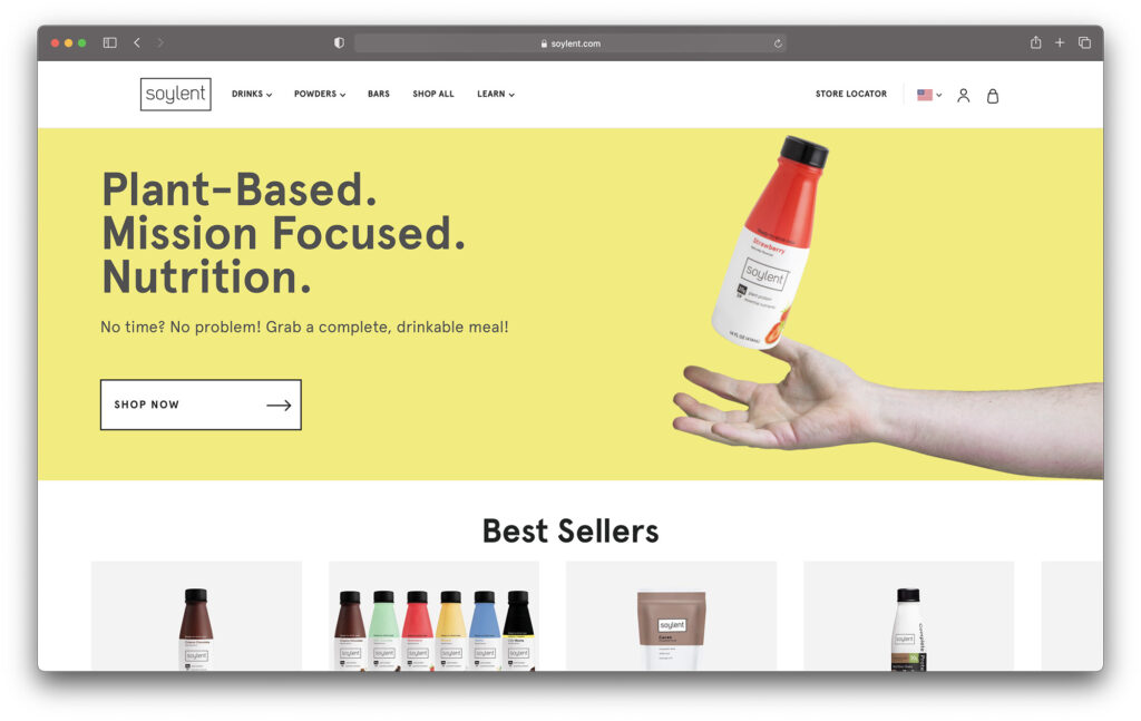
Here’s an example of the meal replacement product store Soylent and their homepage Shopify sections:
Source: Soylent
As you can see, the homepage includes an image with a text section at the very top, providing the main message of the brand at the top. It also includes a “Shop now” call-to-action button to urge users to start shopping.
Plus, straight after that, we can see a featured product section with the best-selling items in their store. This can help enhance social proof, showcasing that other customers find the products appealing, and drive more conversions.
If you’re just starting, you can get Shopify for just $1/month for the first 3 months. This means you can optimize Shopify sections and get high conversion rates extremely cheap.
Conversion-focused Shopify section strategies
There are many ways you can convert casual browsers into committed buyers by optimizing your Shopify sections. Here are a few strategies you can implement:
1. Showcase social proof
Social proof like customer reviews or media mentions helps other visitors understand real customer experiences and improve trust in the brand. You can add a Shopify section with testimonials on product pages or at the middle or bottom of the homepage.
2. Highlight best sellers or new arrivals
A section with new arrivals can show returning customers that you have a new assortment they can browse through. Meanwhile, showcasing your best-selling items can demonstrate to new website visitors that your brand has products that people highly value, increasing credibility.
3. Utilize storytelling
Incorporate sections that tell your brand’s story or the stories behind your products. This emotional connection can influence buying behavior and make your products stand out.
4. Offer discounts
Convince your Shopify store visitors to buy by implementing sections with limited-time deals or special promotions. This can not only convince your loyal customers to buy again but also attract new customers.
5. Add a clear CTA button
Consider adding a clear CTA button at the top of your homepage. It directs users and creates a seamless path to navigate them to the next step you want them to take, such as buying an item.
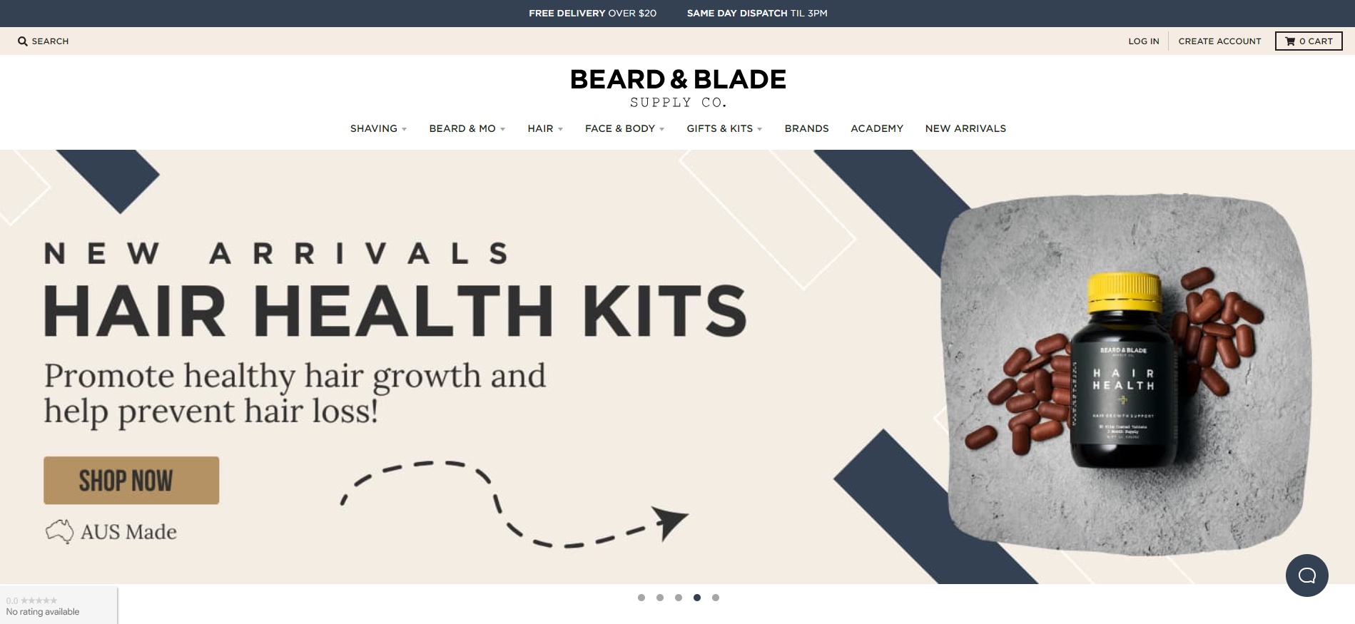
Here’s an example of the Beard & Blade company homepage:
Source: Beard & Blade
As you can see, there’s a CTA button named “Shop now” which directs users to a page with new arrivals. It can help grab users’ attention and lead them to buy products.
6. Optimize images
Optimizing the images in your Shopify sections ensures a structured layout and can even improve page speed. The faster your website, the more visitors are likely to stay on your site. Here are a few ways you can improve the visuals on your site:
Choose the right size. Make sure your Shopify image size doesn’t exceed 4472 x 4472 pixels or 20 MB.
Write informative file names. The file names of your images should be descriptive. Instead of naming them “screenshot.jpg”, be more creative and name them based on content. For example, “waterproof-nike-jacket.jpg” or similar.
Include alt texts. Always add alternative texts to your image as it helps search engines understand your content better. This, in turn, can improve your position in search engines, increase organic traffic, and ultimately lead to higher conversions.
The fastest way to optimize images in bulk is to get a third-party Shopify app like TinyIMG. It allows you to compress your visuals and edit alt texts all in one place.
7. Use A/B testing
Ensure you test different layouts and content types on your Shopify sections. This will show you what drives the most conversions. Try different button, image, and text placements and see which combos get the best results for your Shopify store.
How to customize Shopify sections and blocks
Source: Seedlogic
Shopify sections and blocks offer a powerful way for merchants to control the layout and functionality of their online store. By understanding and utilizing these features, you can customize your store to better meet the needs of your audience and enhance your conversion rates.
How blocks work within sections for granular control
Source: Shopify
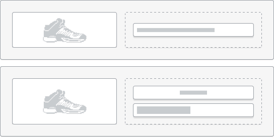
Each section on your Shopify store can contain multiple block types, which act as individual content units within the section. These can include text, images, videos, products, or even custom HTML. The real power of using blocks within sections is the granular control they offer.
You can adjust, rearrange, or update each block independently without affecting other parts of the section, which allows for highly customized page layouts. Here’s how to do it:
- Adding blocks. In your Shopify admin, go to Online Store > Themes. Find the theme you want to edit, and then click Customize. Navigate to the section where you intend to add a block and click “Add Block.” Choose the type of block you would like to add, such as a text block, image, or product recommendation.
- Arranging blocks. Drag and drop the blocks within the section to rearrange their order. This allows you to prioritize information as per your marketing strategy, ensuring that the most important messages or products are placed prominently.
- Customizing blocks. Each block type comes with its own set of customizable options. For example, with a text block, you can change the font size, color, and alignment. With an image block, you can adjust the size and add a link. Take the time to explore the customization options to optimize the appearance and functionality of each block.
Advanced techniques and tools for optimizing sections
Unlocking the full potential of your Shopify sections involves more than just aesthetics and basic functionality—it's about enhancing and streamlining the user experience to maximize conversions.
Here are some techniques that can significantly upgrade the way you utilize Shopify sections in your online store:
- Integrating app blocks. Many third-party apps provide app blocks. You can integrate them into your Shopify sections. You can add advanced review systems, live chat services, or pricing modules using app blocks. They let you add these features to your sections without complex coding.
- Enhancing functionality with support blocks. They enhance functionality and tailor the shopping experience. This could involve adding new features, like size guides or color swatches. They would go directly into product descriptions. This would boost user engagement and cut bounce rates.
- Optimizing with section groups. They are cohesive elements that can be repeated across your store for a consistent look and feel. This saves time. It also ensures that changes made in one section can be applied to others. This keeps things the same and reduces manual work.
- Identifying blocks for better engagement. Advanced tools can help you find blocks that are doing well and those that are not. You can use user data to make decisions. It will show you which elements to highlight, adjust, or remove. This will optimize each section for better engagement and conversion.
- Customizing with theme blocks. These blocks let you fine-tune the look and function of each section. Customization is vital for standing out in a competitive market. It offers unique shopping experiences that captivate and convert visitors.
Tools for optimizing Shopify sections
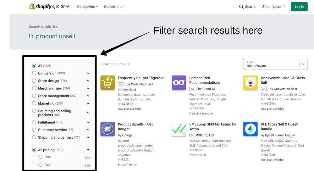
The Shopify App Store offers a plethora of tools designed to augment the capabilities of your store’s sections. These tools range from design enhancers and layout builders to analytics apps that help you fine-tune each element for better performance.
Source: Shopify
Using these apps, you can customize your sections beyond the default settings offered by your theme, allowing for a more tailored and effective presentation of your products and content.
Shopify theme sections: finding the perfect fit
When setting up or revamping your Shopify shop, selecting the right theme is crucial. A theme sets the foundation for how your store looks and works. It affects not just looks but also customer experience and backend use.
There are free and paid themes you can choose from. Here’s a quick comparison of free and paid Shopify themes:
| Pros | Cons | |
| Free |
|
|
| Paid |
|
|
The ultimate choice depends on your budget and business needs. Below are some tips for selecting the right theme for your Shopify business:
- Identify your needs. Before browsing the theme store, list the features, design style, and customer experience necessary for your project.
- Look for flexibility. Opt for themes that offer extensive and customizable Shopify sections and blocks. This ensures that the theme can grow and adapt as your business evolves.
- Check the theme performance. Check how your favorite theme choices look on mobile devices to ensure easy adaptability.
- Read reviews. Before making a purchase, read theme reviews online to see how other merchants feel about it.
Conclusion
Optimizing Shopify sections is essential for enhancing the user experience and driving conversions. Some of the strategies to improve sales include showcasing new or best-selling items, highlighting social proof, offering discounts, optimizing images, adding CTA buttons, and more.
However, the most important thing is creating unique content with a structured layout. If you create a brand that speaks to its target audience, you can be sure that your conversion rates will eventually improve.

